


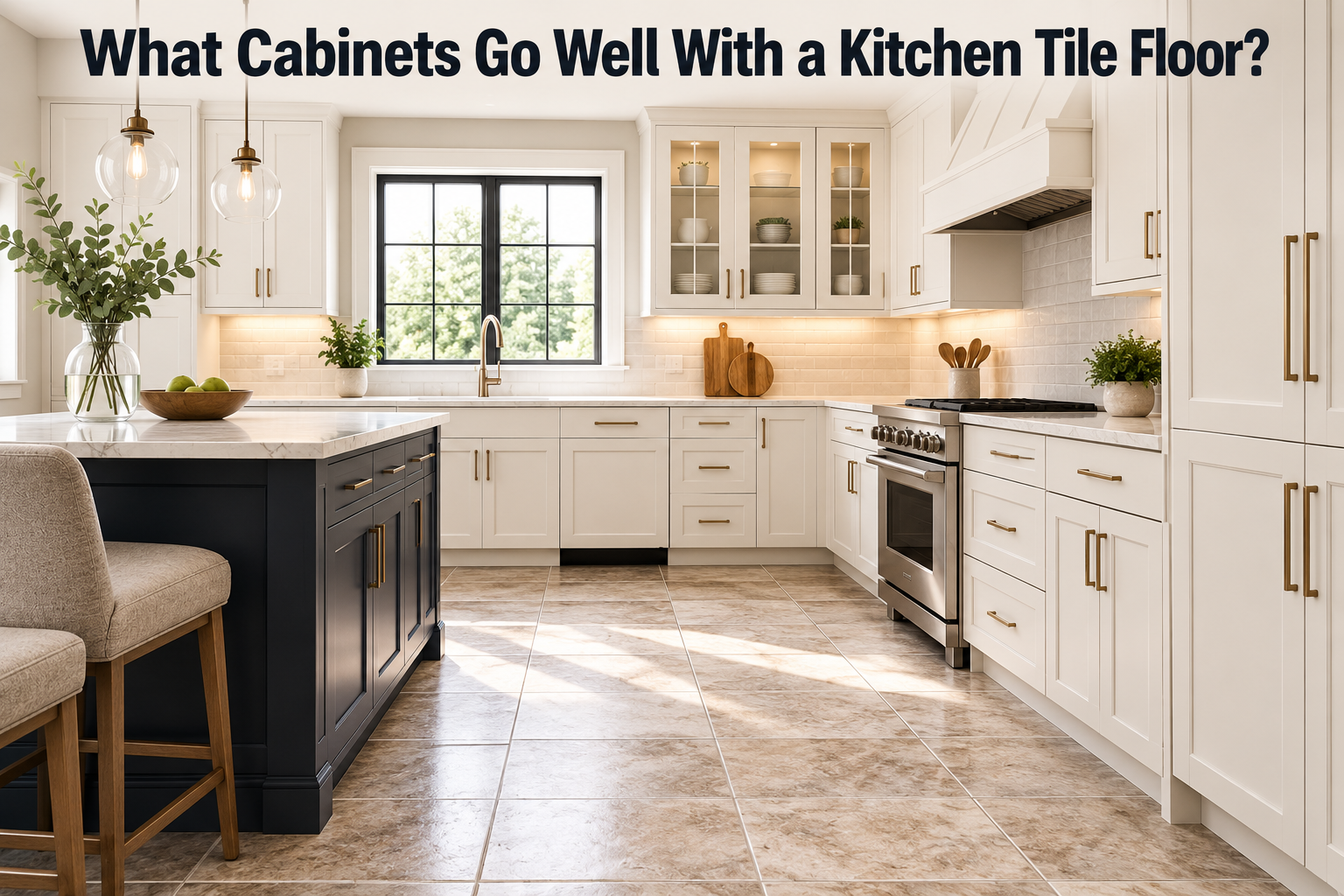
The cabinets that work best with a tile floor share the floor’s undertone and sit at a clearly different lightness. Match the warmth or coolness so nothing clashes, then make the cabinets noticeably lighter or darker than the tile so the two surfaces stay distinct. Get those two things right and almost any color reads as intentional.
Your floor is the fixed piece here. It is heavy, expensive to change, and it is already down. So you build the cabinet choice around it, not the other way round. This guide shows you how to read your tile, then gives specific cabinet picks for the most common floor types.
The short answer: match the undertone, vary the lightness
Two ideas do most of the work. The first is undertone, the quiet hint of yellow, red, brown, blue, gray, or green sitting underneath a color. Warm floors want warm cabinets; cool floors want cool cabinets. A cool gray cabinet next to a warm beige tile looks slightly wrong even when you cannot say why, because their undertones are fighting.
The second idea is contrast in lightness. If your cabinets and floor are close in both color and brightness, the room goes flat and a little muddy. Push them apart. Light tile pairs happily with mid-tone or dark cabinets; a dark floor lifts under lighter cabinets. You want the eye to read floor and cabinet as two separate things.
| Quick rule: keep the undertone the same, change the lightness. Same temperature, different brightness. That single move solves most floor-and-cabinet pairings. |
How to read your tile floor before you pick cabinets
Before you shop for cabinets, spend five minutes figuring out what your tile is actually doing. Two floors that both look “gray” can lean completely different directions once you hold samples against them.
Find the undertone. Lay a plain white sheet of paper on the tile in daylight. Against true white, the tile’s bias jumps out. You will see it lean yellow or pink (warm), or blue or gray-green (cool). Do this near the window and again under your kitchen lights, because tile can shift between the two.
Check the value. Squint at the floor. Is it light, medium, or dark overall? That tells you which way to push the cabinets for contrast. A busy, patterned, or heavily veined tile also counts as visual weight, so treat a strong pattern a little like a darker floor and keep the cabinets calmer.
Note the finish. A glossy, polished tile bounces light and reads cleaner with smooth, flat cabinet doors. A matte or textured tile, like a honed stone or a rustic terracotta, sits better with warmer wood or painted cabinets that have a bit of texture of their own.
Best cabinets for each type of tile floor
Here are the pairings that reliably work, grouped by the floor you already have. Each one keeps the undertone in agreement and shifts the lightness for contrast.
Wood-look tile. These warm, plank-style tiles behave like a wood floor, so treat them that way. Light oak or honey-toned tile loves crisp white, soft cream, or a warm greige cabinet, which keeps the space bright and airy. For a warm, layered look, a deep green or navy cabinet sits beautifully against a light wood-look floor. If the tile itself is a darker walnut tone, lighter cabinets give you the contrast you need.
Gray or cool tile. Cool floors want cool or neutral cabinets. White, pale gray, and greige all work, and this is where blue really shines. A mid to deep blue or a slate green cabinet pops against light gray tile without clashing, because the undertones agree. Keep an eye out for warm-yellow woods here, since a strongly orange oak cabinet tends to fight a cool gray floor.
Beige, cream, or travertine tile. Warm neutral floors are forgiving. Warm white and creamy off-white cabinets keep it light and classic. For contrast, a mushroom greige or a soft brown wood cabinet grounds the room. Rich, saturated colors like a warm terracotta-adjacent green also read well because the floor is already warm.
White or very light tile. A light floor is a blank canvas, so this is your chance to add color or depth up top. Mid-tone and dark cabinets look striking against white tile, and this is a great setting for a bold navy, forest green, or charcoal. Natural wood in a medium or dark stain gives the same warm-organic effect. Even black cabinets work if the room has enough natural light.
Dark or black tile. A dark floor carries a lot of visual weight, so lift the cabinets above it. White, cream, and light wood keep the room from feeling heavy or closed in. If you want the moody, all-dark look, pair dark cabinets with a dark floor only in a kitchen with strong natural light, and break it up with lighter counters.
Patterned or encaustic tile. A patterned floor is already the star. Let it lead and keep the cabinets quiet. Solid white, soft neutral, or a single color pulled from the pattern itself will tie the room together without competing. Two loud elements in one small room is one too many.
If you would rather scan the pairings at a glance, here is the same advice in short form.
| Your tile floor | Cabinets that work | Undertone to match |
| Light wood-look | White, cream, greige, navy, deep green | Warm |
| Gray / cool | White, pale gray, blue, slate green | Cool |
| Beige / travertine | Warm white, mushroom greige, soft wood | Warm |
| White / very light | Navy, forest green, charcoal, dark wood | Either (add depth) |
| Dark or black | White, cream, light wood | Contrast lighter |
| Patterned / encaustic | Solid neutral or one color from the pattern | Pull from the tile |
Should cabinets be lighter or darker than the floor?
Either can look great; what matters is that they are clearly different. The most common and most flexible move is light cabinets over a mid or dark floor, which keeps the room feeling open. Dark cabinets over a light floor is the bolder, more dramatic version and works well in kitchens with good light.
A simple way to keep the whole room balanced is the 60-30-10 idea. Roughly 60 percent of the space is your main color, often the perimeter cabinets or walls, about 30 percent is a secondary color such as the floor, an island, or the counters, and the last 10 percent is accents like hardware and lighting. Your tile is a fixed part of that split, so count it first and let it guide the rest. You can read more on the 60-30-10 rule if you want to plan the full palette.
The one combination to avoid is cabinets and floor that are close in both color and lightness. Same tone, same brightness, and the room loses its shape. Give them room to breathe.
Mistakes that make the pairing look off
Most floor-and-cabinet pairings that feel wrong come down to a few repeat offenders. Steer around these and you are most of the way there.
- Clashing undertones. Warm cabinets on a cool floor, or the reverse. This is the number one culprit, and it is why a sample in the actual room beats a guess every time.
- Trying to match the floor exactly. Aiming for the same wood tone or the same gray on both surfaces usually reads flat or slightly off, since two near-matches rarely line up. Complement the floor instead of copying it.
- Too little contrast. Cabinets and floor at the same brightness blur together and make the room feel smaller and duller.
- Ignoring the light. A tile that looks cool by the window can look warm under kitchen bulbs. Always check samples in the room, at the times of day you actually use it.
- Two busy surfaces at once. A patterned floor plus loud, high-contrast cabinets fights for attention. Let one lead and keep the other calm.
Conclusion
Start with the floor you already have, find its undertone, and match it: warm with warm, cool with cool. Then set the cabinets at a clearly different lightness so the two surfaces read as a deliberate pair. Test your top samples on the tile in real kitchen light before you commit. Do that, and whatever color you land on, from crisp white to deep navy, will look like it was always meant to be there.
Frequently asked questions
Do my cabinets have to match my floor tile?
No, and matching exactly often looks flat. Aim to complement the floor instead: keep the undertone the same, then choose a cabinet in a clearly lighter or darker value so the two surfaces stay distinct.
What cabinet color goes with gray tile floors?
Cool and neutral cabinets work best. White, pale gray, and greige keep it calm, while a mid to deep blue or slate green adds color without clashing. Avoid strongly orange-toned wood, which fights the cool floor.
What cabinets look good with wood-look tile?
Treat wood-look tile like a wood floor. Light planks pair with white, cream, warm greige, navy, or deep green. If the tile is a dark walnut tone, go lighter on the cabinets for contrast.
Should cabinets be darker than the floor?
Not necessarily. Either direction works as long as they differ. Light cabinets over a darker floor keep the room open; dark cabinets over a light floor look bold and suit rooms with plenty of natural light.
What cabinets go with white or light tile floors?
A light floor is a blank canvas, so add depth up top. Navy, forest green, charcoal, or a medium-to-dark wood all stand out against white tile. Even black cabinets work in a bright room.
Related Articles
Garage Floor Wet When It Rains: Causes & Fixes
How to Arrange Stone Pots on the Floor?